Print Magazine
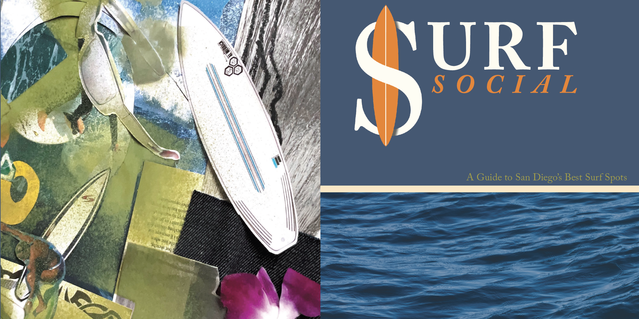
Surf Social San Diego Edition is a printed guide to the top twenty surf spots of San Diego. For the overall aesthetic of the guide I wanted it to encompass the fun energetic feeling obtained when surfing. The design palette draws from coastal hues, evoking a sense of both serenity and adventure. The intentional interplay of hand-drawn illustrations and high-resolution photographs reflects the tactile and visual sensations of surfing, enhancing the sensory experience. With a nod to traditional surf culture and a pulse on modern aesthetics, Surfing Soul balances heritage with contemporary design. The fusion of collage elements, typography, and layout mirrors the harmony between humans and nature on the waves.
Included on this page
Inspiration
Process
Mockups
Final Design
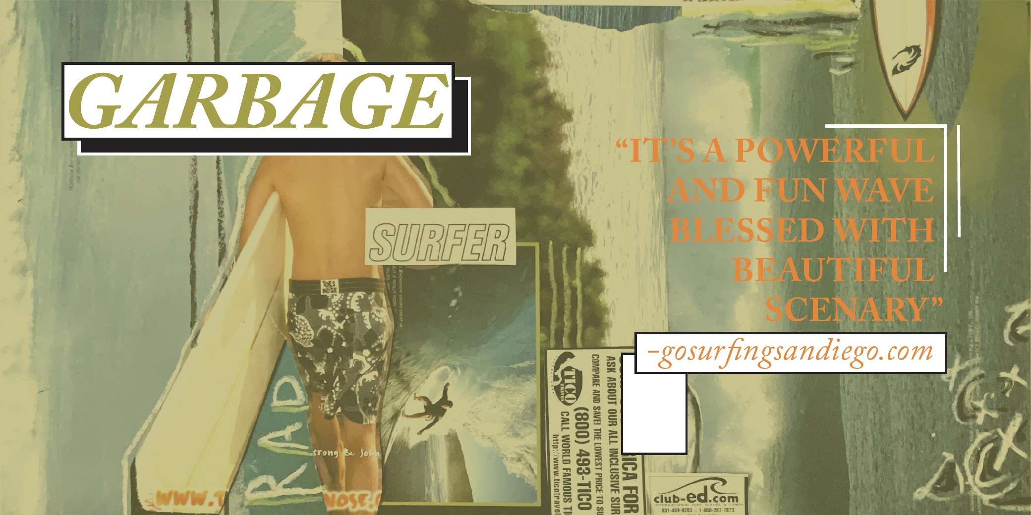
Inspiration
My inspiration for the passion guide sparked from floating out in the ocean at sunset with my friends and playing around in the waves. I wanted to encompass that feeling of serenity in San Diego's beauty with the thrill and energy of its waves. For the design itself I took a ton of inspiration from David Carson and his freeform playful designs. I wanted to keep the deep blues of the ocean paired with oranges of the sunset and a pop of vibrant green to mimic the vibrancy of surfing.
Process
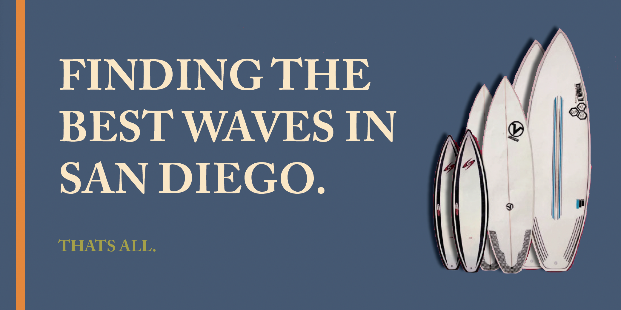
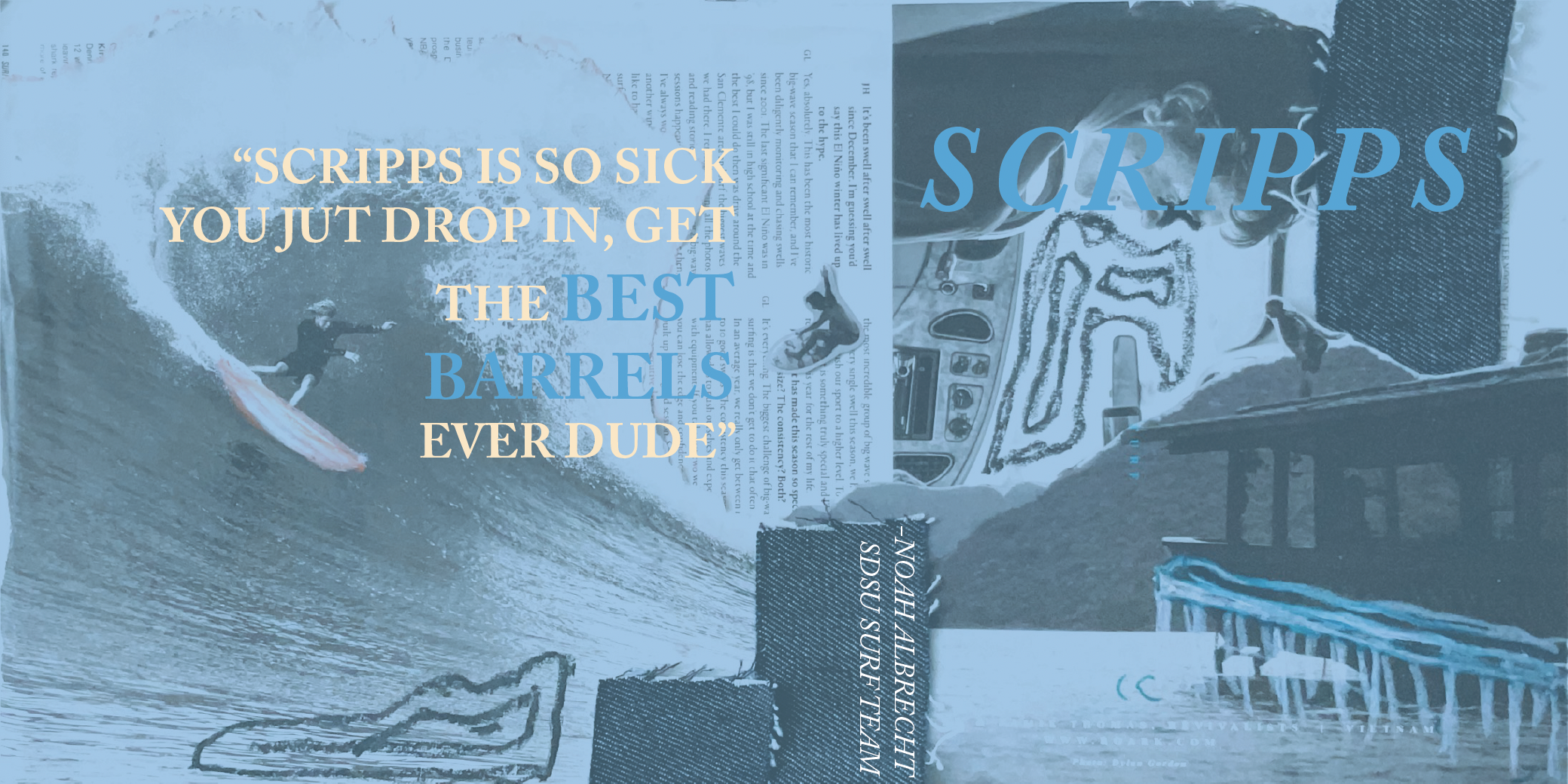
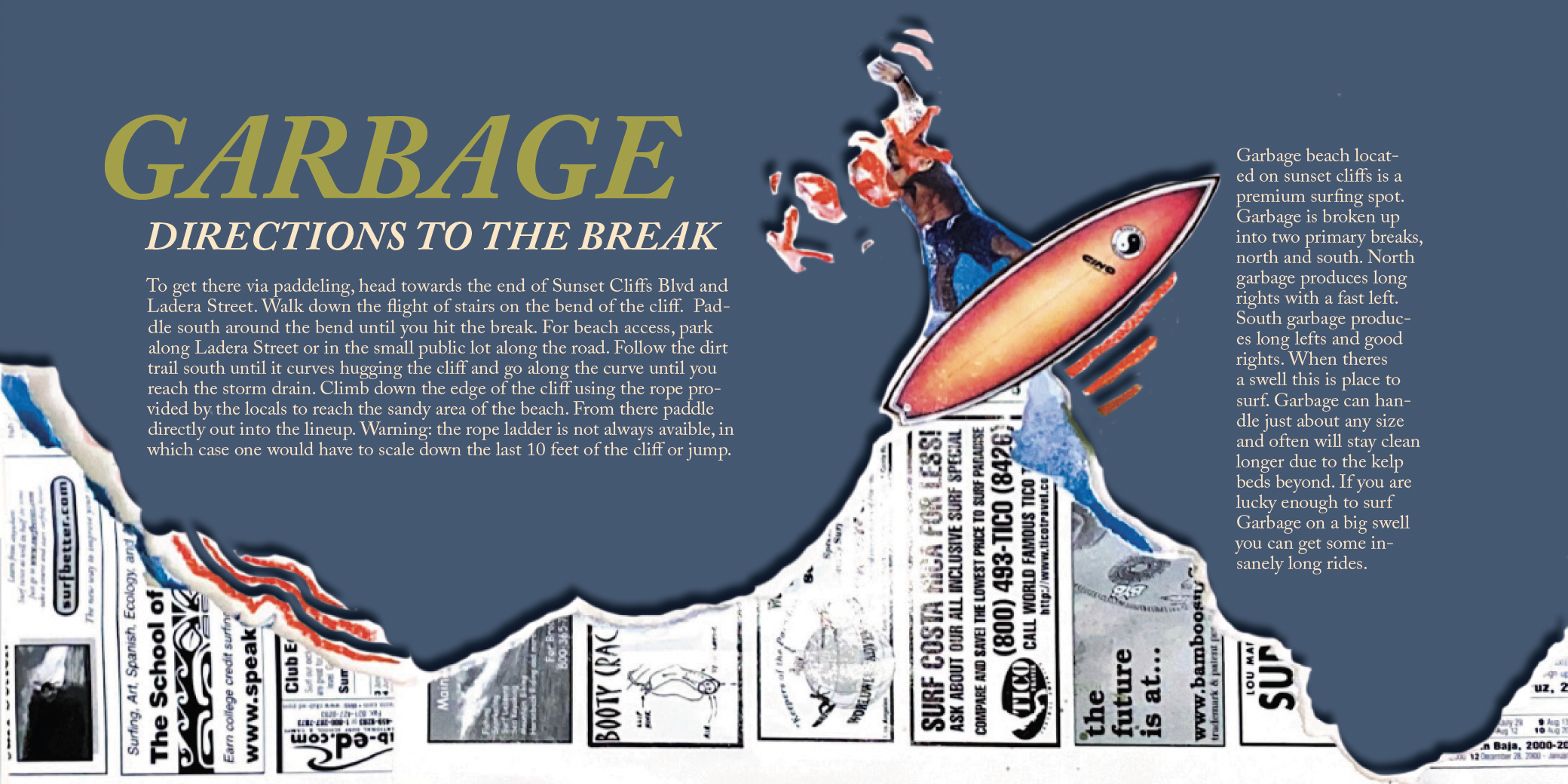
I started this project by sorting through old surf magazines and cutting out whatever struck inspiration. From there I created a grid for the book to follow to slightly ground it with the ununiform collaged aspects and make the entire guide feel more cohesive. For the list of top twenty spots I reached out to the San Diego State University's surf team and had them submit a list of their favorite spots. I then researched the beaches and went to the top three myself to fully grasp the feelinf encapsulated there and translate it into the print guide.
Mockup
Final Design
This project was a fun creative challenge. As much as I loved the topic and the direction I chose to take with the aesthetic, I really had to push my to find balance between the collage and a clean organized layout. Specifically because of the chaotic motion of the collage mirroring the waves of the ocean with pops of bright color was contrasting the clean grid my professor required for the assignment. However the discipline of the grid was a good learning point for me as it taught me to follow specific guidelines similar to those that would be presented by future clients. Overall this project was a fun, engaging, and energetic, which proved to be even more of a challenge when I then created the digital app version.